What a Difference! (Before/Afters)
Everybody loves a good BEFORE and AFTER! It seems like magic to see an outdated, poorly designed room transform into a jaw dropping space. It’s not magic and takes a whole lot of planning, work and detailed execution, but it’s SO satisfying to complete a project and be able to share it with the world.
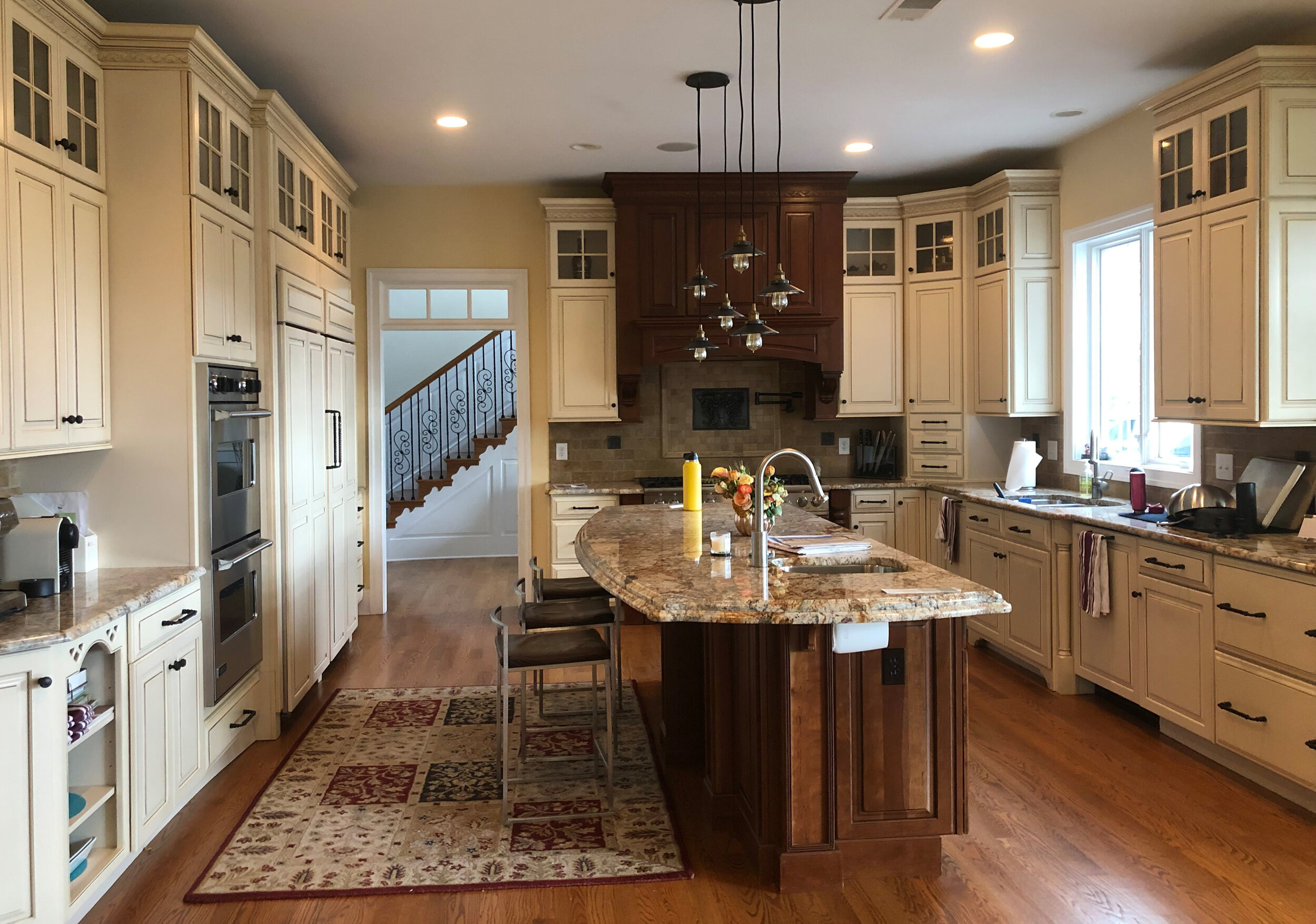
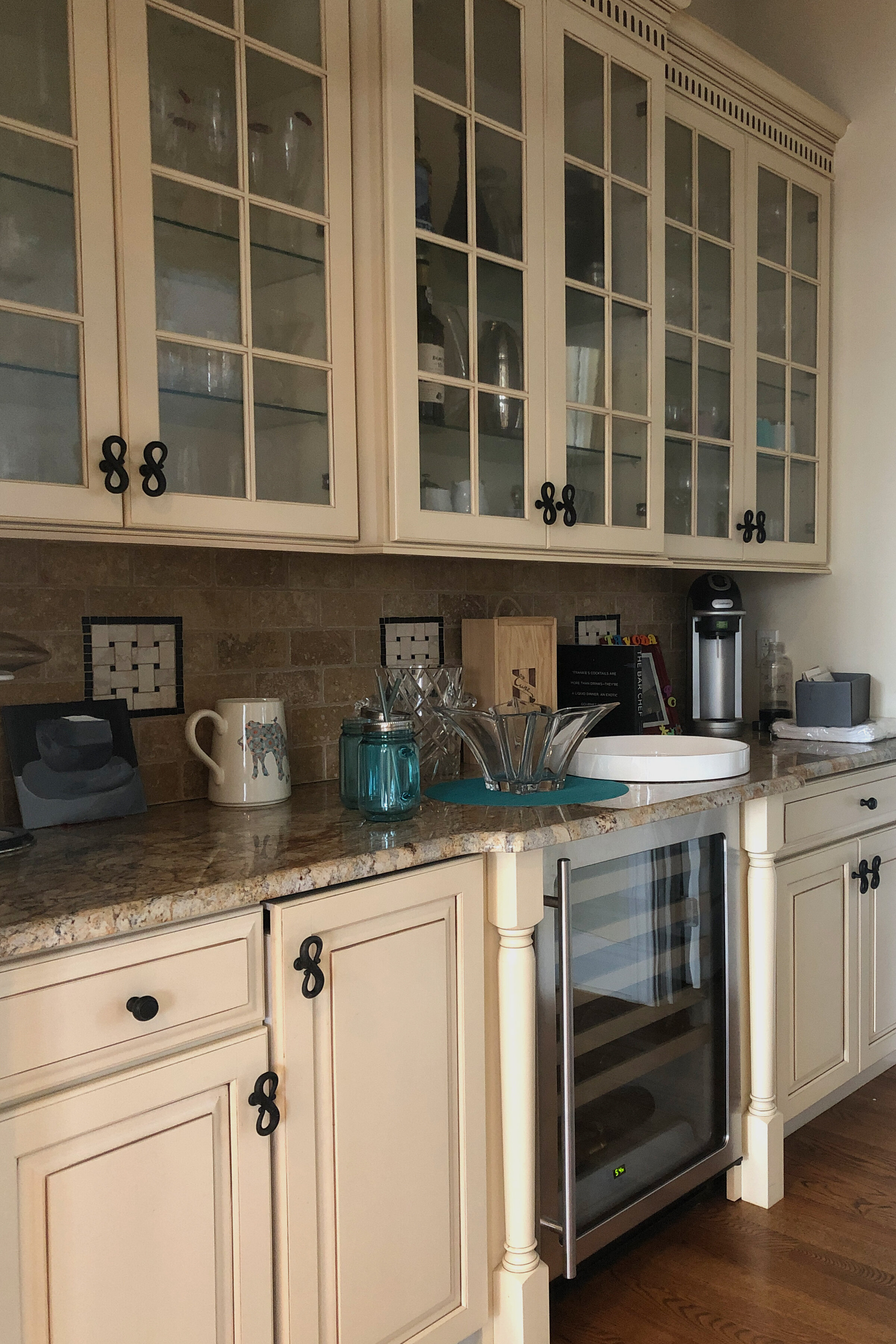
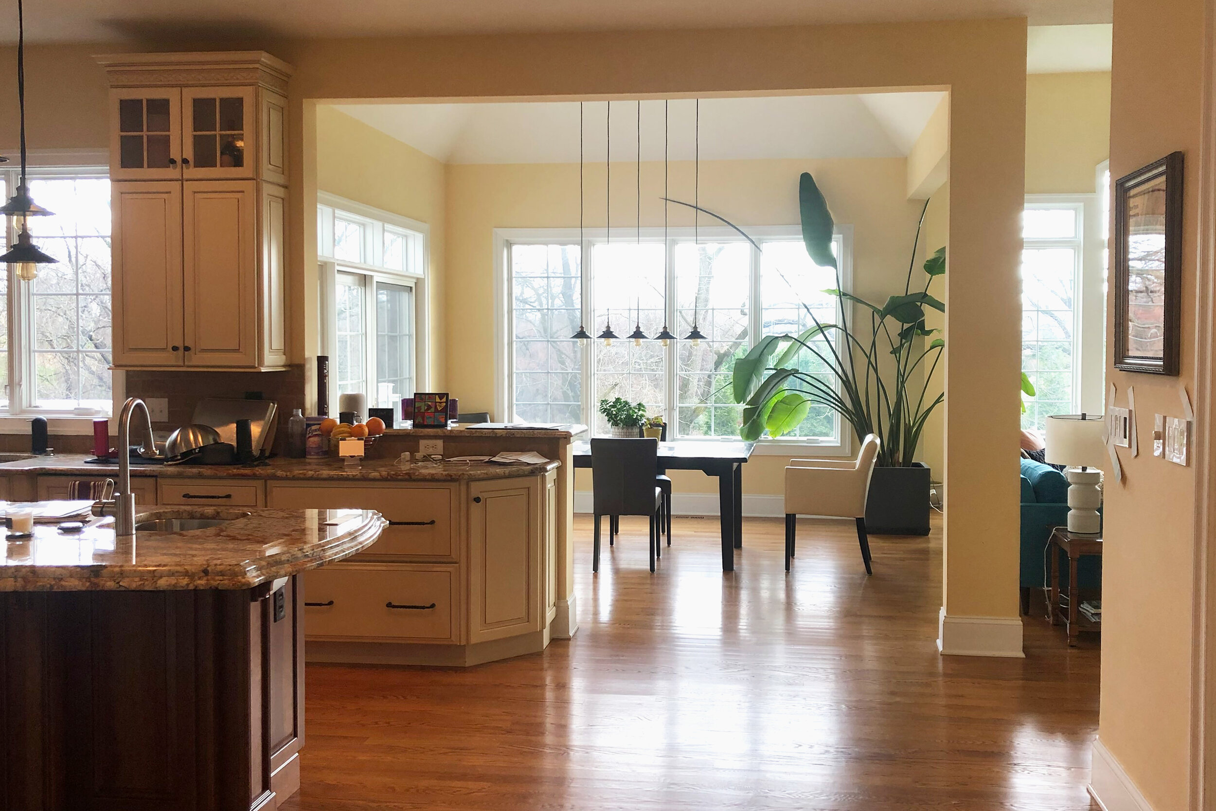
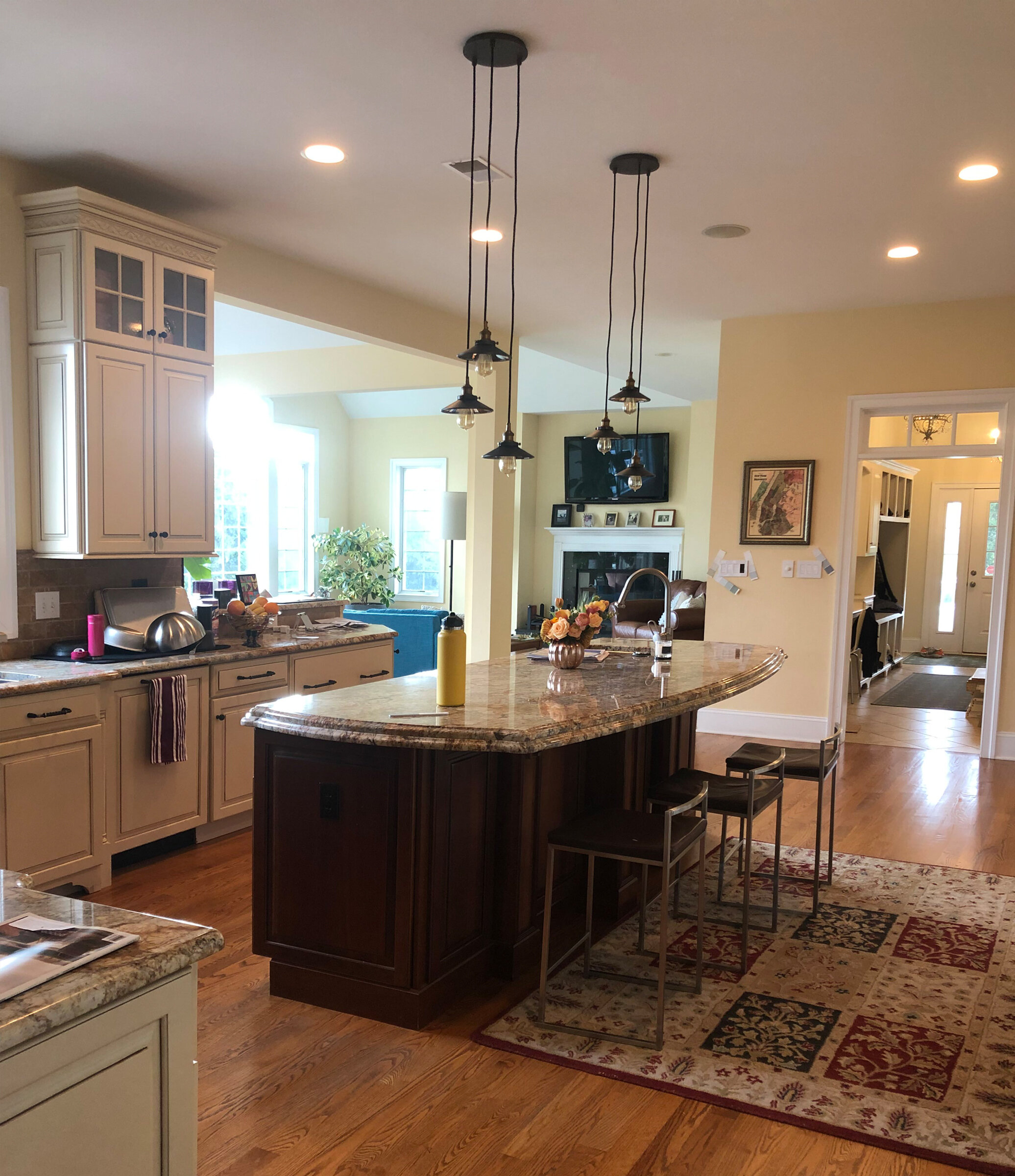
This West Chester kitchen was only about 14 years old, but it looks straight out of the 90s. Dated finishes, weird details and a relatively small island given the scale of the room.
Our clients wanted a bright, modern space with lots of glamorous, up-to-date finishes. Check out how things turned out!
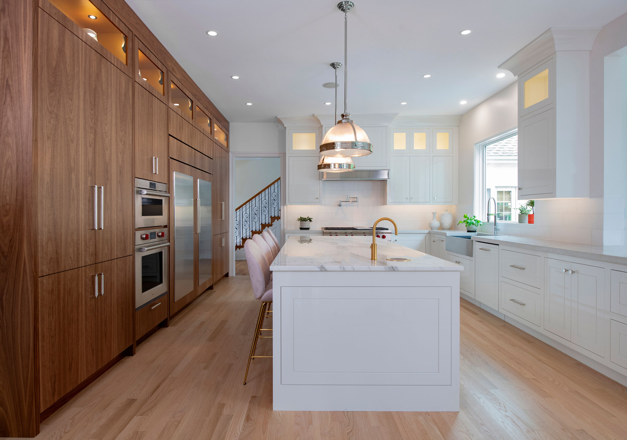
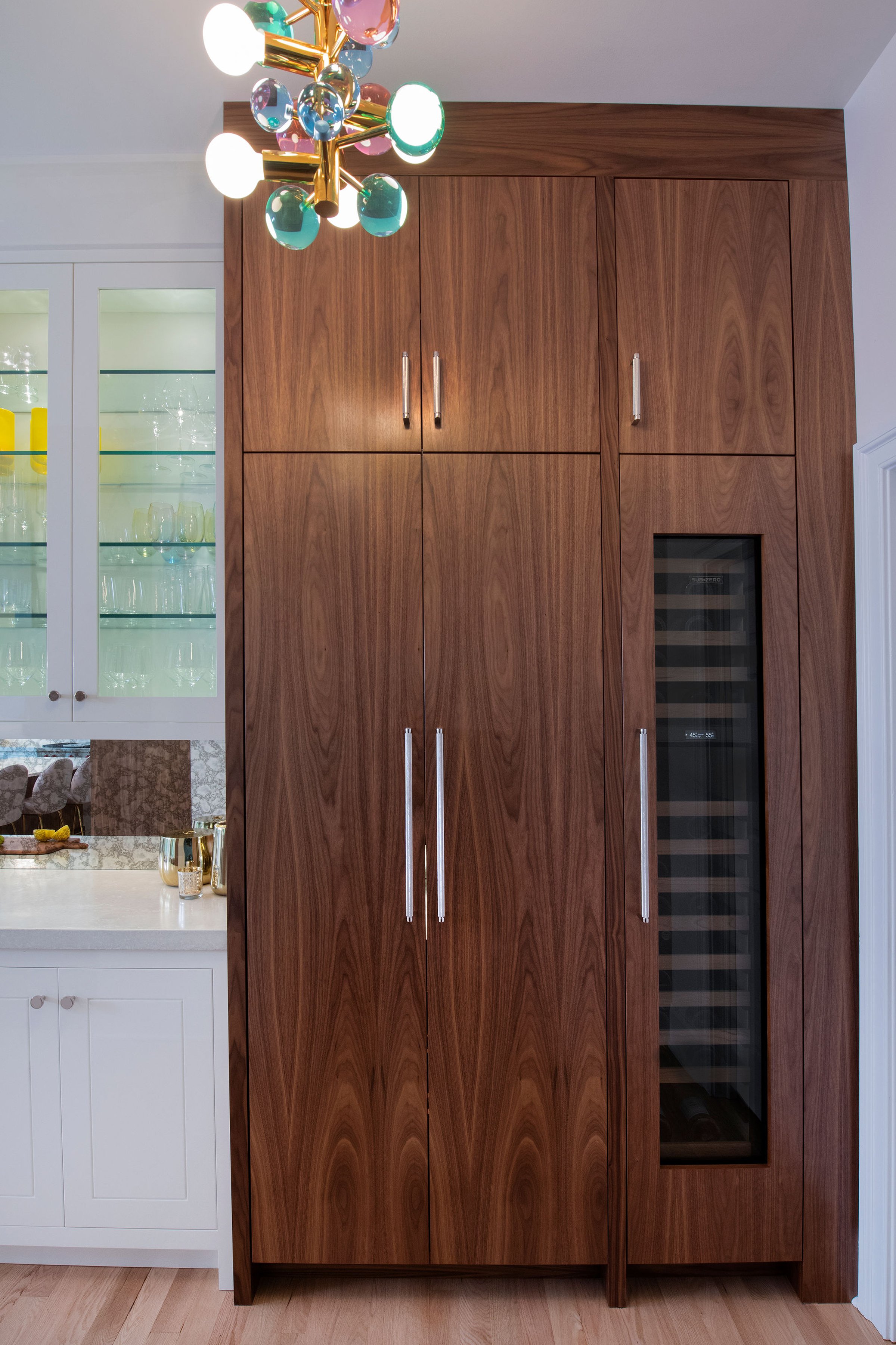
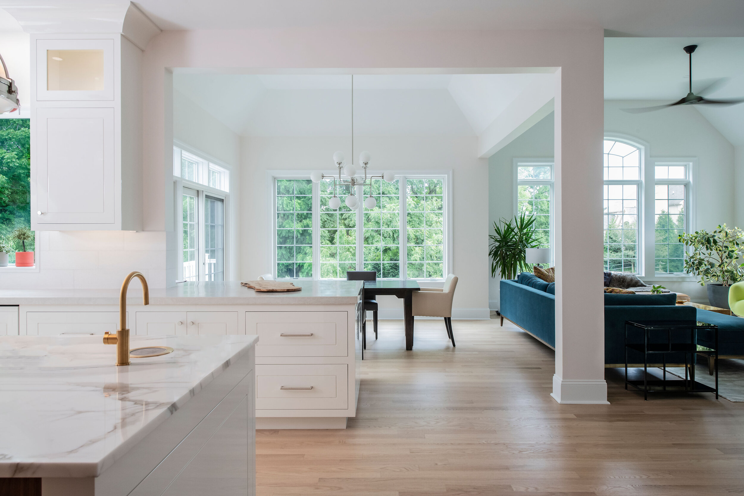
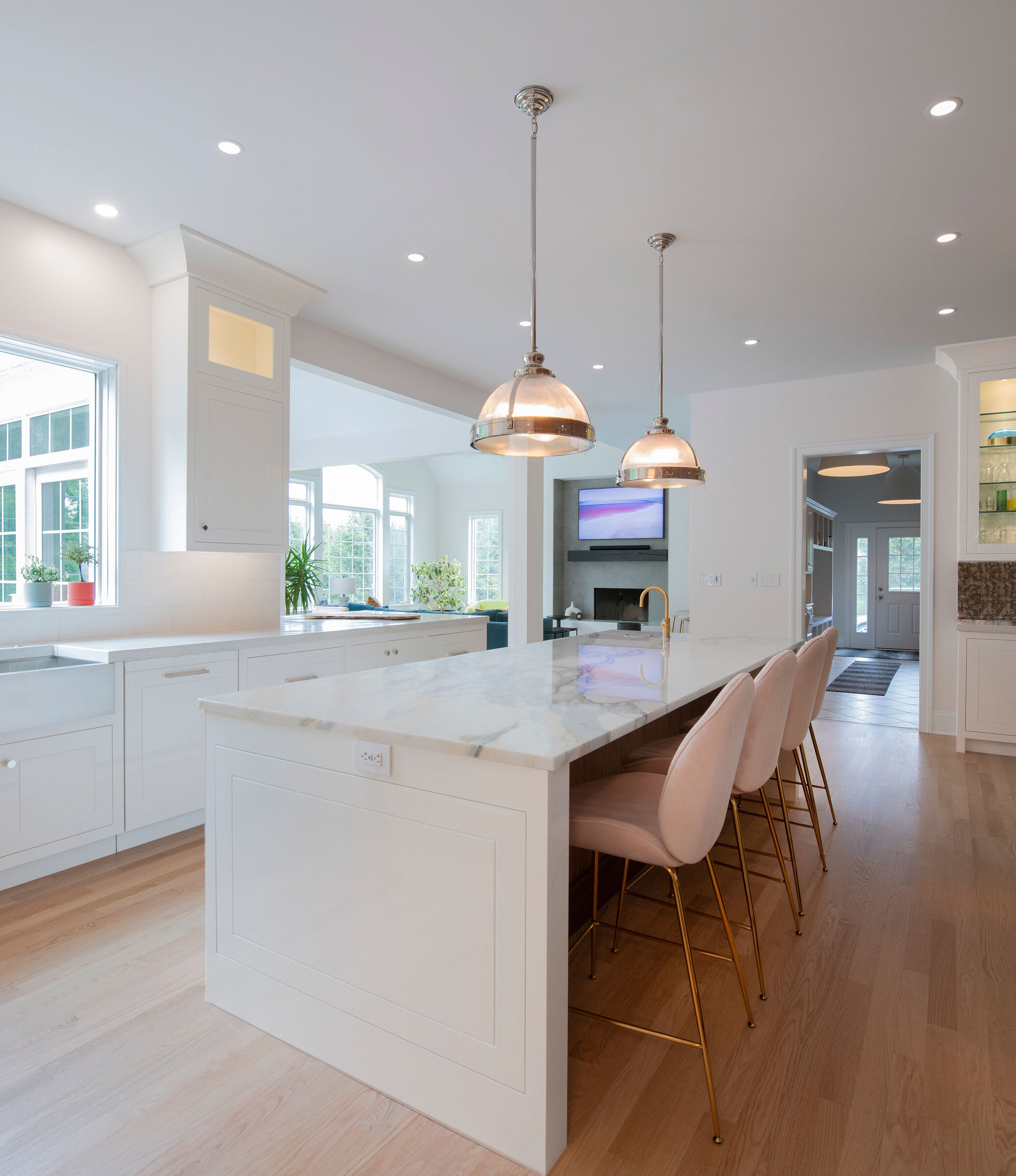
Even though we still used painted and wood finishes, there's no resemblance to the original kitchen. Beautifully grained walnut is the star on the oven wall. High gloss painted white cabinets on the island and right side brighten up the space considerably.
We used a rare Calacatta marble on the larger island for a luxurious feel. Eliminating the corner cabinet to the right of the range opened up the space and allowed the window to be enlarged. We mixed up the lighted cabinets by using gold leaf paint in the walnut side ones.
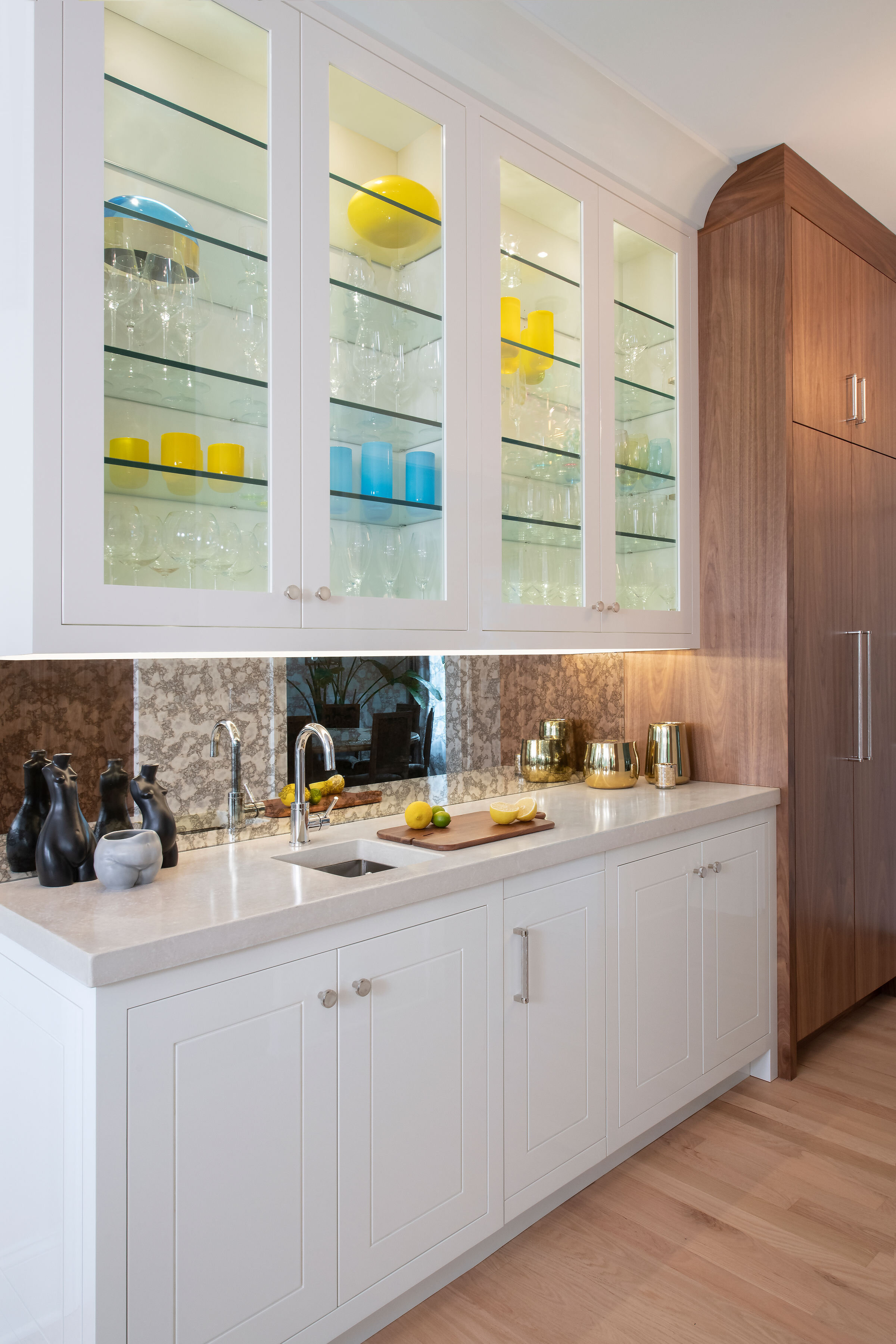
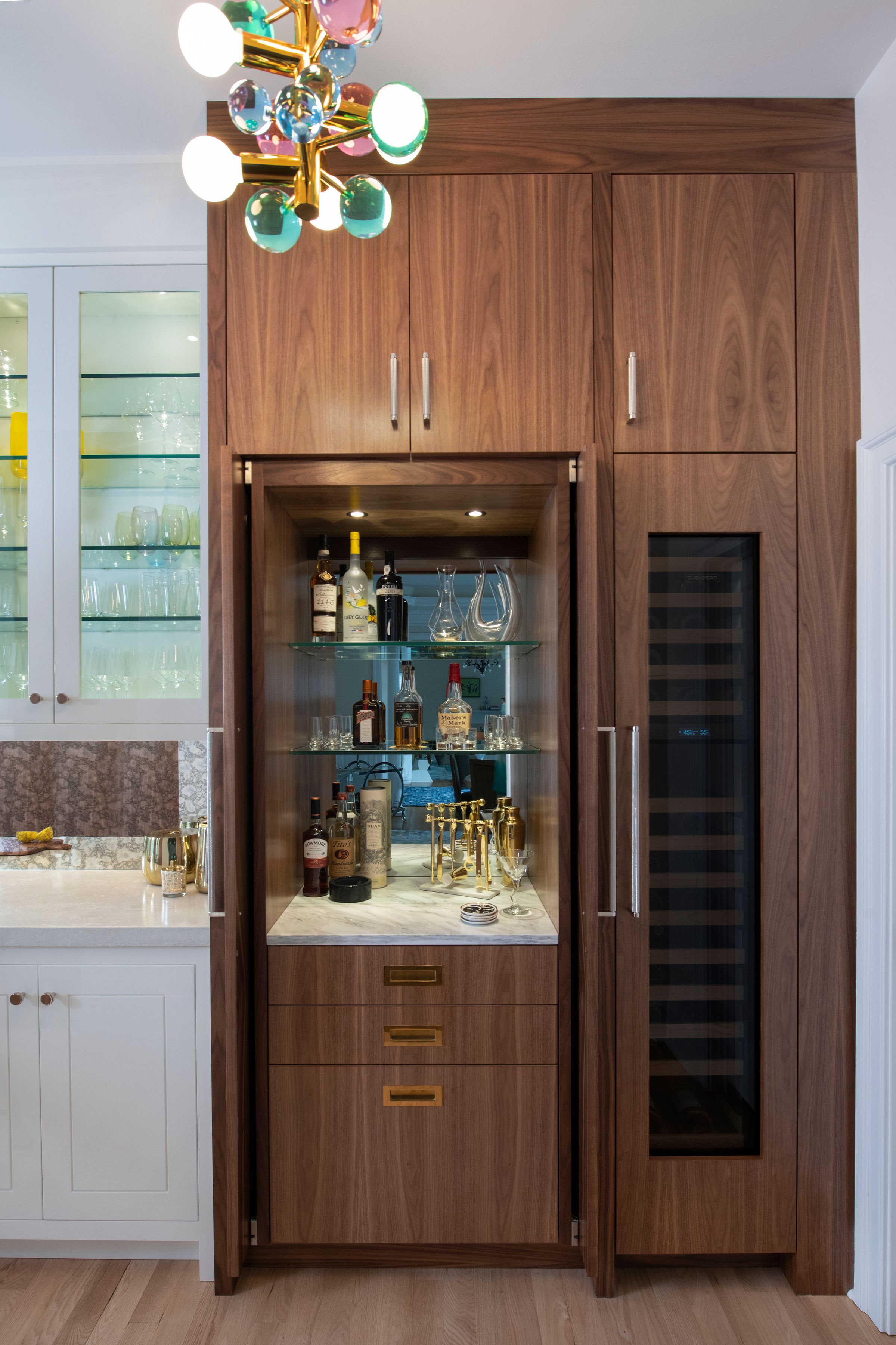
Ok, wow! What a difference, indeed. Bright lighted cabinets highlight our client’s collection of glassware. At the far end, pocket doors reveal a hidden bar. Antique mirrored glass adds some warmth to the backsplash wall.
Light and bright was the goal in this renovation. Clean lines and no clutter help keep the room peaceful, while the plants bring life and color. Some more storage was added to the dining room side of the cabinets for entertaining needs. Concrete counter tops on the kitchen perimeter make the design more interesting and keeps the island feeling like the super star it definitely is.
Aside from being made from a stunning piece of natural stone, the island is larger, providing more seating and additional prep area. The faucet at the end serves up boiling hot water, filtered still water, and sparking water, too!
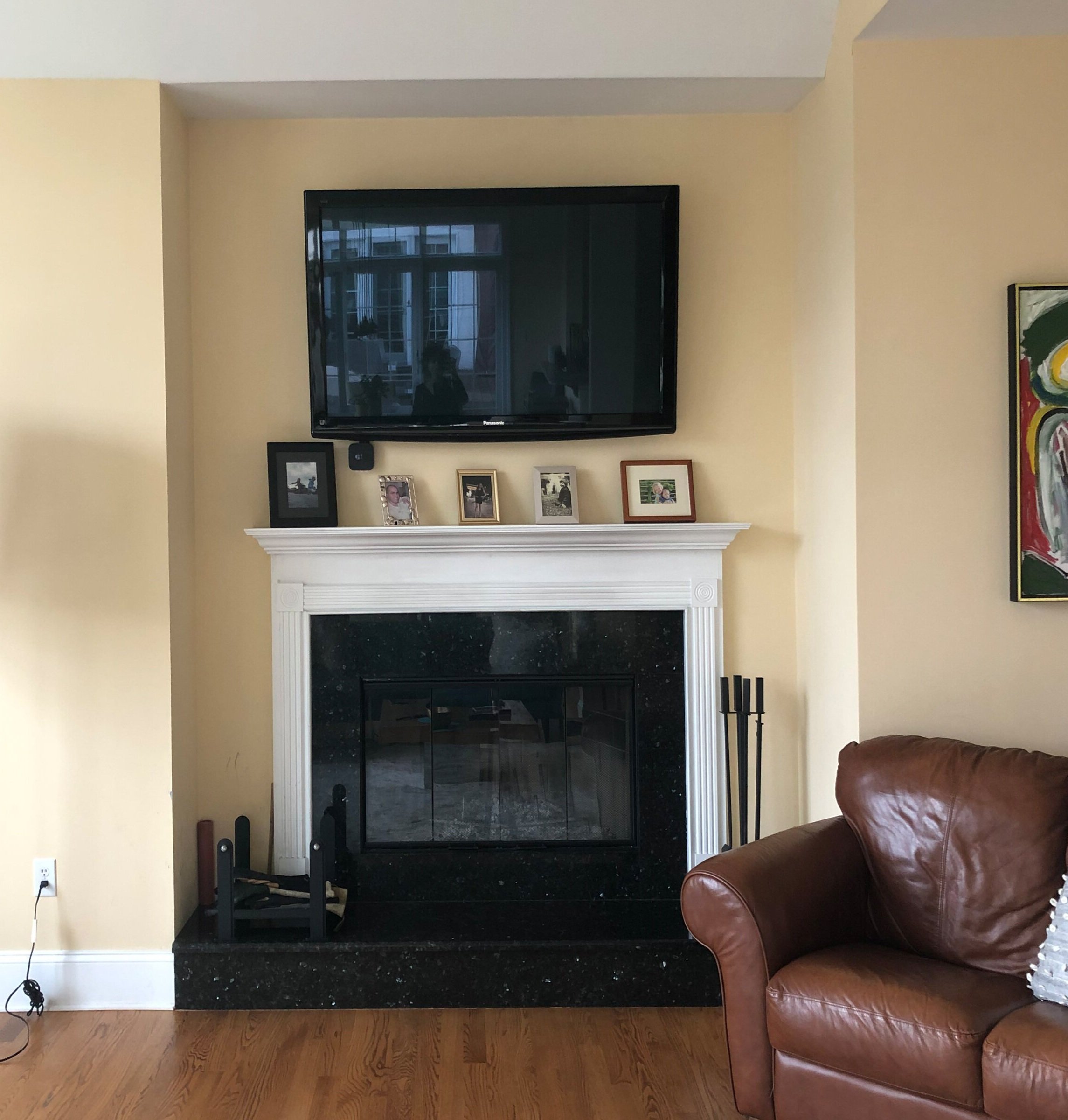
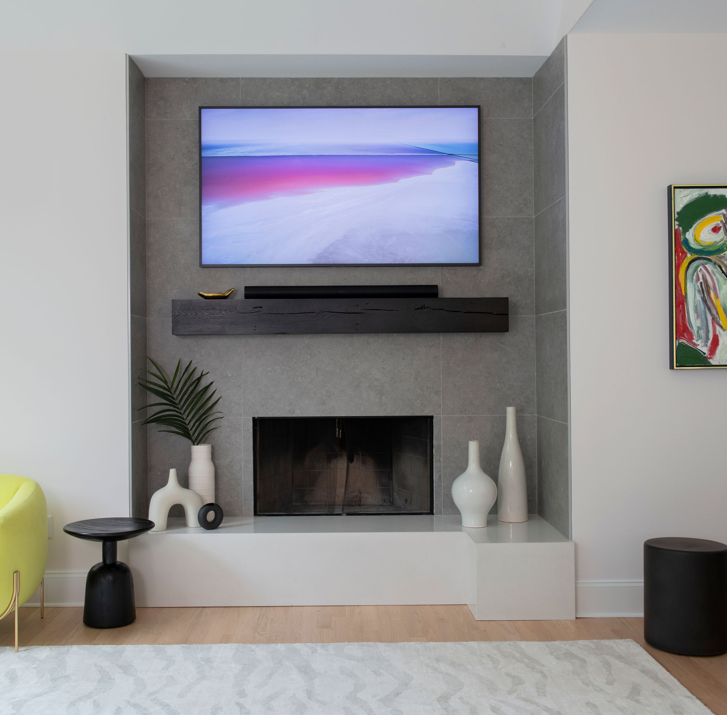
The fireplace surround was B O R I N G and resembled every other center hall colonial. The area was widened, large scale porcelain tile was added, and a rustic mantle keeps it feeling warm and inviting. The clients loved the concrete counter tops so much that they asked to use it on the hearth as well. The new hearth wraps around on the right, providing a space to display accessories, seating for parties or just cozying up to the fire.
We absolutely loved these clients, whose sophisticated tastes and modern aesthetic made this project very rewarding. Working with Hazley Builders (West Chester, PA) and Superior Woodcraft (Doylestown, PA) was icing on the cake. Collaborating as a team with clients, builder and vendors means a successful renovation that all of us are proud of.
If you are thinking of remodeling your kitchen, we hope you think of us to help you!
(Check out the full project here)

